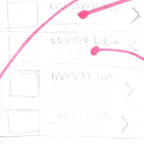
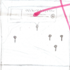
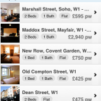
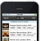
 Nestoria is a property search engine where thousands of people come every day to look for houses. The site was founded in 2006 and since then a lot has changed in how people browse the web. When I joined the company in 2011, roughly 10% of all visitors were using a mobile phone or other small-screen touch device and we were not serving them as well as they deserved. We decided to create a separate mobile web version of Nestoria from scratch (see http://m.nestoria.co.uk).
Why a separate mobile website
The choice between a native app and the web was easy. Most of our users first arrive on Nestoria after they search for what they are looking for on Google. If someone is looking for “flats to rent in shoreditch”, it’s important that we give them what they are looking for: a list of all the flats there are to rent in Shoreditch. Nestoria is all about content and there’s nothing we hate more than having to install an app to get access to that content. HTML5 was already mature enough for our purposes, offering access to device location, local storage etc. so there was no need to introduce any barriers to entry or exclude people on unsupported devices.

Nobody likes these popups
Choosing whether to offer Nestoria’s mobile experience as a separate website or not was a bit more difficult. By late 2011, all the pieces were in place to create responsive websites that adapt to device constraints, but the existing site was mostly built in 2006. We could slap on some media queries to beat the site into shape for mobile devices, but we wouldn’t really do them justice. Re-engineering the site would take time and in the mean time, mobile users would be left using the unoptimised site. Besides, the current site is heavily optimised for search engines and all these SEO modifications add weight for mobile users on the go. A separate mobile website, while introducing some usability problems, would allow the site to be a lot more light-weight and load faster. As page load strongly correlates to people abandoning the website, speed was ultimately more important.
Initial Design
Nestoria Mobile was designed to be as complete as possible within the constraints of a small screen. After some very informal exploration of how people use their phones and search for houses, we decided to initially focus on existing users of Nestoria who are coming in from Google. It turns out that many users on a mobile device are not mobile at all: they are searching from home, but using their phone. An interesting side effect of this is that these people start in the middle of the search process: they land on the SERP, the page with the list of results. The design of the mobile interface therefore revolves around this page.
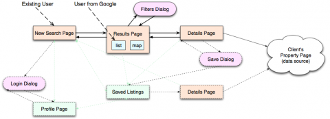
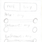
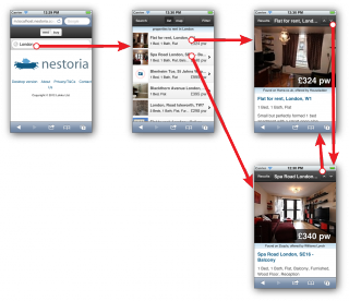
On Nestoria, a lot of information is shown on the SERP. There is a title describing the search, a map showing where they are, some filters to modify the search and a lot of metadata about the area. On a smaller screen, this would eat into too much precious space. Rather than showing everything in one screen, the information was grouped and split into new screens: the SERP contains of a single screen with two views (list and map) and the filters were put in a pop-over panel. Moreover, where Nestoria normally shows lots of information about each listing (a title, keywords, description etc.), this would make the list too crowded. Instead, this extra information was split off to a separate detail page, which left more space for a big photo, a full description etc. This lead to the following screen flow diagram:
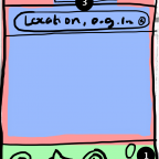
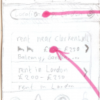
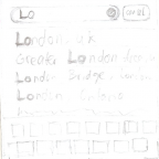
To get to a working product fast, the initial focus was on the pages on the critical path (from new search or SERP to external website, optionally while filtering). Screens were first sketched on paper to produce a paper prototype, then converted into an interactive HTML mockup to test transition behaviour.
Refining the design: Detail Pages
During user testing right after launching the first version, we found that while users liked the detail pages, they were a bit cumbersome to use, because users had to go back back and forth between details pages and the list of results. To make browsing of details easier, browsing between detail pages was added. For this, several alternatives were proposed. An important issue was what mental models users have while browsing the results. The list of results was laid out vertically, with results appearing above and below each other. It therefore intuitively made most sense to conceptually lay out the detail pages vertically as well. On the other hand, we wanted to allow the user to use gestures to swipe back and forth between detail pages and as these pages contain lots of information, vertical swiping was already reserved for scrolling. Additionally, the existing pages were conceptually laid out horizontally, which was conveyed using animated transitions. Both options were considered.
1. Horizontal Navigation
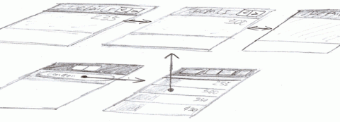
A solution to allowing horizontal navigation (and thus gestures) between detail pages, was to change the arrangement of pages in the application, so that detail pages are conceptually on top of the list of results. Rather than using a right-to-left transition, they pop up, after which navigation between detail pages can be done horizontally.
The following two videos show two interactive mockups of how this could work. In the first mockup, detail pages still occupy the whole screen. This leaves more space for information, but does not clearly convey that the user can go left and right. In the second mockup, parts of the previous and next result are shown on the side, to be more explicit.
Two variations of horizontal navigation between detail pages.
1. Popup Screens
2. Horizontal Carrousel
2. Vertical or Stacked Navigation
Leaving the horizontal ordering of existing pages intact would require different navigation between the pages. Again, two ideas were considered. The first idea extends the mental ordering of detail pages from the list: pages are conceptually above and below each other in the same way the results are ordered.
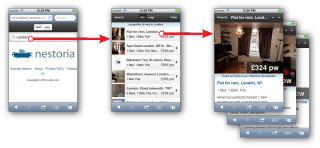
Another idea was to consider the detail pages to be all on a big pile or stack. Paging up and down between them would then move up and down the stack, which could be visualised using page curl transitions.
In the end, we concluded that apart from what animations would be appropriate, there is no practical difference between these two solutions. In the end, a solution with no transitions that could be interpreted as either a stack or a horizontal list (depending on the user’s mental model) was implemented. It looked much like the mockup in the video below, except that in the final implementation, the buttons were bigger and pages were numbered to allow users to keep track of where they were in the results:
