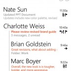
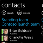
Microsoft has historically not been known for their strong design and taste, but in the age of Metro it’s too easy to say they fundamentally don’t care about design. In fact, the Metro Design Language, with its focus on content first, strong typography and minimalistic chrome, may have been one of the best things to come out of Microsoft in a long time. Allowing Metro to escape the dying Zune and redefine the Windows Phone User Experience was a great idea and may very well have saved Microsoft’s Mobile presence from the shipwreck that was Windows Mobile.
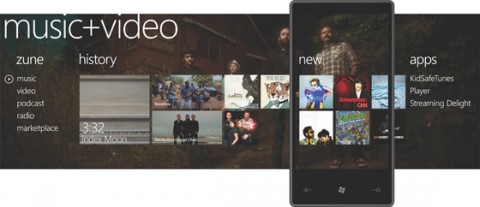
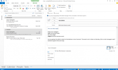
Applying those principles to a long line of legacy applications is not a trivial task at all. When I saw the first videos of Windows 8 having a Metro and a Desktop mode, I didn’t know what to think of it. Was Microsoft going to half-ass Metro or were they playing it safe by offering a legacy environment for their workhorse apps such as the Office suite. Looking at the preview of Office 2013, they have done the worst of both worlds: keep the legacy chrome-heavy interface, but pretend like it doesn’t exist and call it “Metro”:
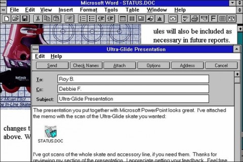
Where Metro’s focus on content over chrome aims to make things overwhelming, my first reaction to this screen shot was mild panic and disorientation. Rather than making an effort to remove some of the chrome (which might have upset power users who finally got used to the infamous Ribbon), Microsoft has opted to just paint it plain white instead. In doing so, it has turned a highly complex, hierarchical interface into a highly complex, hierarchical interface with absolutely no cues to understand what everything does. Even worse: it has become almost impossible to see what is content and what is part of the interface. I’d say that was a lot easier on the first version of Microsoft Office:
Now back to Office 2013:
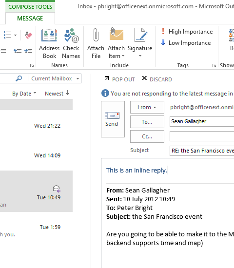
It shouldn’t take this much effort to see what is a title bar and what is a menu; what is the list of emails and what is the sort bar at the top. In this screenshot, it’s even hard to see what is a button and what is a text input field. They are both white squares on a white background with a grey border and text in the middle. The Office team is seriously missing the point of Metro here. Maybe Office should have a Metro mode and a traditional mode. Maybe there is a good way to unify the flat and minimalistic look&feel of Metro with the classic interface of Office and let some of that beautiful typography cross over. Right now, it’s not minimalistic, it’s confusing. It’s not clean, it’s just obfuscated. It does not feel like a Metro app, it just feels bad and that’s a shame, because they could have learned a lot from Windows Phone.
