Service Design in the wild: Virgin Media Disruption Status

This morning the Internet connection at my apartment stopped working. After checking the router and restarting it a couple of times didn’t solve anything, I figured there might be a network disruption. Now, one of the most annoying things about Internet service disruptions is that you can’t easily go on the Internet to see what’s going on… except nowadays there is a device that remains unaffected: your phone. This morning, I found that my Internet provider, Virgin Media, has done a pretty good job addressing this common scenario, so I’m sharing it here. A sort of unplanned service safari.

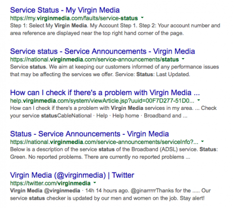
After ruling out all obvious problems on my end and concluding that it might be a network service problem, the first thing I did is what I expect many other people would do: I searched on Google for “virgin media status”. The top 4 results all lead to Virgin Media’s website, with the first link leading to “Service Status – My Virgin Media”. The fifth result, by the way, is Virgin Media’s Twitter account, but it looks like that’s only operated on weekdays, which is a shame.

Screenshot of google results

The top result, My Virgin Media Service Status page, turned out the be just what I needed. The page asks you to log in with your details or search by postcode, account number or phone number. In my case, my phone remembered my login details, so I just needed to hit submit, but otherwise searching by postcode would have been a good option. The page would have been almost perfect, were it not for a line at the bottom, which says:

“Get your services down a phone line?
Then you’re a Virgin Media National customer. Check out your National service status page.”

Here, a bit of Virgin Media’s organisational silos seep through, which is a shame. I don’t see why customer’s need to know whether they are “National” customers (what does that even mean?) and it would be nicer if there were a single status page for all customers.

In my case, however, this was the right place, and logging in presented me with a reassuring message:

Screenshot of Virgin Media status with alerts dialog

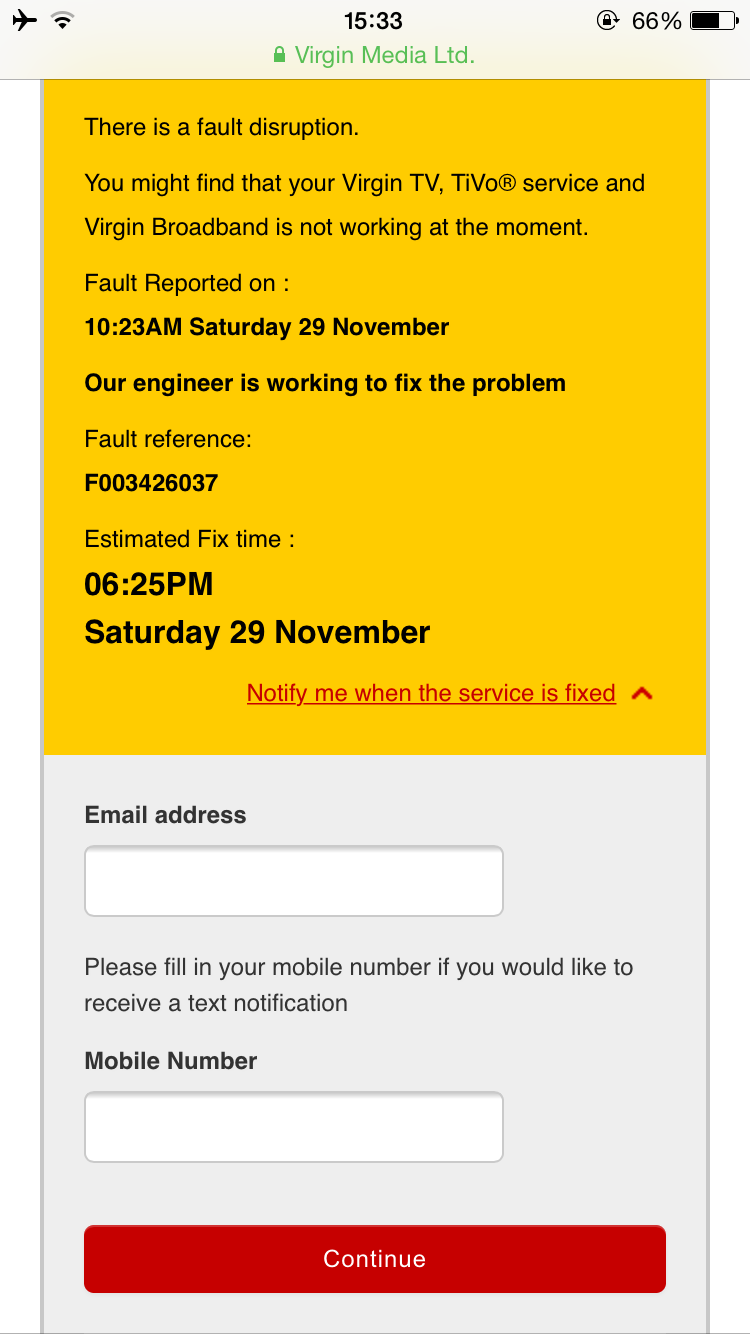
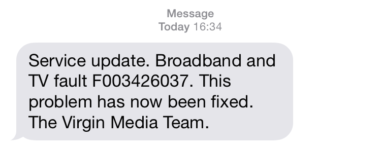
The message is clear and to the point: Yes, there is a fault. Yes, your broadband is not working because of it. Yes, we are working on it, and we expect it to be resolved by the following time. It answers everything and even though the expected resolution time is not exactly good news, it still feels good to know what to expect. An especially nice touch is the ability to receive alerts by email and/or text message. I was a bit disappointed that the fields were not pre-filled with details from my account, but tried it out anyway. A few hours later, I got a message and I was back online:

SMS Alert from Virgin Media

Conclusion

All in all, Virgin Media has done a pretty good job here. Service disruptions are never fun, but their status page offers a clear answer to the most pressing questions (what’s up and when will it be finished) and having alerts mean customers can stop polling the status page for changes and go do something else until they are notified.

At the same time, there is also still room for improvement. The fact that there are different status pages for different types of customers is confusing. Many customers won’t know whether they are on Fibre or ADSL, let alone which branch of the company they have a contract with. These details can all be stored in a “My Virgin Media” account, and otherwise customers can be taken to a single status page with faults explained per network type.

I’m also surprised that Virgin Media’s Twitter account is inactive on weekends. With customers becoming more demanding and less patient, this would be one of the first stops for many. Finally, I would really like to be able to set up these alerts for all disruptions. I realise that this might be risky for Virgin Media, because it might mean telling me about disruptions that I would normally never notice (because I am not at home, asleep or not using my line for other reasons), but it wouldn’t be hard for them to do and would save me the trouble of having to figure out what’s going on when there is a problem; making the whole thing just that bit nicer.

Rapid Prototyping Physical Environments

Physical environments play an increasingly important role in designing digital products and services. In a world of mobile devices and connected things, how they all fit together in physical space becomes just as important as the design of the individual elements.
Continue reading 

Design and the Developing World

A few days ago, a tweet by Amy Quispe appeared in my feed:

Completely true of course. I’ll be the first to admit that I sometimes curse my iPhone for running out of juice when I’m out and about all day. Most of the time though, I’m surrounded by power outlets, and it’s easy to ignore how short my battery really lasts. People in rural India or central Africa, however, may not have the luxury to be so forgiving – especially considering a mobile phone is often their primary way to access the Internet [1]. The current generation of smartphones is essentially completely useless unless you spend most of your day at home or in an office where you can keep it tethered to a charger. It’s clear that these devices are primarily designed for the “First World” (where customers have deeper pockets).
Continue reading 

A Simple Mac Web Server App

I like little single-purpose utilities that do one thing and do it well. I regularly make little web apps and prototypes and have come to rely on using the python built-in web server that comes with Mac OS X, for quickly spinning up a local web server without having to deal with configuration. It’s as easy as opening a terminal, navigating to the right directory and typing "python -m SimpleHTTPServer". I wanted to make that even simpler, so I did.

The Simple Web Server Mac App lets you drop a folder onto its icon to serve its contents as a static website in seconds. It doesn’t get much simpler than that. Download it here. Enjoy!

Screen Shot of Simple Web Server

Download Simple Web Server from GitHub.

An expensive line of code: scaling Node.JS on Heroku

One of the perks of working in multidisciplinary teams for the past few years has been that there I have continuously been surrounded with people with more tech chops than me who would tackle the really hard problems™. While working on a little thing for the Human Tide project, I was reminded how tricky some of those problems can be sometimes.

Continue reading 

Mining the long tail: extracting insights from search data

The first step in improving the user experience of a product, service or website is understanding its users. The best way to understand what users want and what keeps them busy is still to seek them out and listen to them. When you don’t know who your users are yet or can’t reach out to them, it’s time to get creative and look for other sources of information. I’ve recently been working on redesigning the website of a large car manufacturer and found the data from the current site’s search function to be particularly insightful. It’s hard to find a clearer statement of intent than the words a user typed into a search box. The fact that they are searching for something means that at the very least they are interested in it. Moreover, frequent searches for a particular topic could indicate a problem with the structure of the site or its contents. Of course not all queries will end up in the search box, and these are all just pieces of a bigger puzzle, but there are some good insights buried in this sort of data and I want to share how I get them to the surface. Continue reading 

Super Game Boy: Creativity in Constraints

In 1994, Nintendo released the Super Game Boy. Being lucky enough to own both an original black and white Game Boy and a SNES at the time, I remember not being particularly excited by the idea of playing my handheld games on a small square on the TV, so I never considered it worth my saved up pocket money. What did always puzzle me was how it managed to play black & white games – even really old ones – in colour.

Tetris title screen on Super Game Boy

I have since learned a bit more about this odd little device and have discovered that the Super Game Boy was in fact a lot more interesting than you would initially expect. Continue reading 

Lessons from dConstruct 2012

This week was the eight edition of the dConstruct conference in Brighton. It was a day of information overload and inspiration, and offered plenty of food for thought. From my notes, I have tried to distill the most important messages and lessons from the different talks.

Continue reading 

A Mac OS X Vector Arrow Cursor

Many times when making mockups or design illustrations, I have found myself wanting to include a cursor in the image to show what the user would click on. I have scoured Google Image search too many times, looking for a decent, transparent and preferably scalable vector version of a standard cursor and I never found one that I was quite happy with. The worst part of all of this, is that Mac OS X actually uses vector images for its cursors internally. Some of those cursors are hidden away in a system folder, where they are up for grabs. On OS X 10.7 (Lion) they are here, in all their beautiful vector glory:
/System/Library/Frameworks/ApplicationServices.framework/Versions/A/Frameworks/HIServices.framework/Versions/A/Resources/cursors

Unfortunately, the most important cursor is missing: the arrow. In this discussion on StackOverflow someone pointed out that the “contextualmenu” cursor has an arrow in it that bears striking resemblance to the one used as a regular pointer. All it takes is some cleaning up, and that’s just what I did.

It’s all vector, so it scales beautifully to whatever size you need and it looks best with a bit of drop shadow, like on the original.

Download the Mac OS X Vector Arrow Cursor for your own projects.

Misunderstanding Minimalism

Microsoft has historically not been known for their strong design and taste, but in the age of Metro it’s too easy to say they fundamentally don’t care about design. In fact, the Metro Design Language, with its focus on content first, strong typography and minimalistic chrome, may have been one of the best things to come out of Microsoft in a long time. Allowing Metro to escape the dying Zune and redefine the Windows Phone User Experience was a great idea and may very well have saved Microsoft’s Mobile presence from the shipwreck that was Windows Mobile.

Continue reading