It’s hard to deny tablets are fun and ever since the original iPad was so successfully released and a whole market evolved around tablet computers, it is pretty safe to say they are here to stay. With that in mind, it is interesting to see new ways tablets can be used. One of the most notable roles for this new class of personal computer is as a toy for toddlers. It is amazing how well an iPad, inviting to be picked up and touched, fits into the world of a child, even one that is just two and a half years old:
While working on TeddIR, an interface for children, I was already surprised by how capable even very young children are in using a traditional computer, but the tablet just pushed back the age barrier even further.
The New York Times already showed high hopes for the iPad, predicting it might be a child’s best friend and PCWorld even named it the “Children’s toy of the year”. Of course this was quickly followed by concerns about addiction and other possible negative effects, but the message is clear: kids love tablets.
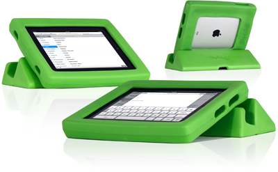
Of course the iPad, or any other tablet on the market as far as I am aware, was never specifically designed for children. The fragile hardware can relatively easy be protected by big rubber frames like the Big Grips Frame, but that still leaves a lot of design challenges open to designers of both the platform and applications.
Gabriel Weinberg wrote an interesting post on toddler app user interface guidelines yesterday and after observing his own son play with his iPad, he provides some good starting points for app developers. I am not going to rehash all of it, you should really just read his post (it is worth it), but here is the list:
- Load the app as fast possible
- Move all settings out of the app
- No pop-ups/notifications
- Make everything tappable/clickable
- Change it up/give surprises
- Give multiple ways to do things
- Give hints
- Add delays
- Give instructions
- Update the app
- Highlight words and letters as you say them
Joined in the comments by several more:
- Spacial consistency – keep buttons in the same place, don’t change their meaning
- Enable multi-touch – kids often accidentally press or touch part of the screen and get frustrated when their touches on other parts are not working
- Never include links that leave outside of the application (that includes in-game purchases)
What is interesting, is that Gabriel closes off with some gripes about the iPad itself and its UI. He notes his kid often accidentally presses the home key while playing, which subsequently closes whatever game or app he was engaged in. From there, children have surprisingly little problems in getting to your collection of private videos and pictures. It is clear that the current home screen of IOS is not suitable for children. They can accidentally delete and reorder apps, photos and mess up settings or get into other kinds of trouble.
Completely disabling the home button seems to solve almost all of these problems, but it kind of takes the flexibility out of the iPad as a toy. One of the wonderful things about a tablet that it can contain whole treasure chest of toys in such a small device, but that requires kids to be able to switch between different apps on their own. What would be needed to make tablets “toddler proof”?
